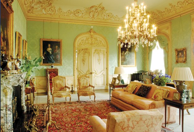
The aristocracy changed the color schemes and furnishings in their homes much less than the upper and middle-classes, but the brushing away of Victorian fustiness and fussiness to welcome the elegant, cleaner lines of the Arts and Crafts movement and Art Nouveau was infectious (led, of course, by the King). The building boom of the early 1900s coupled with new thoughts on hygiene and harmony encouraged home buyers and renters to experiment with color and new modes of decor, and a bevy of books and articles appeared in bookstores, magazines, and newspapers to advise the Edwardians on the best way of decorating every inch of their homes.
Drawing-room Colour Scheme: —By far the most important room from a decorative point of view is the drawing-room. Assuming it to be of fair size, and dealing with the walls chiefly, as the largest area to be considered, it is necessary to determine, firstly, whether they are to be painted or papered, or both combined; secondly, whether they are to be decorated in one prevailing colour of different tones, or in various colours in harmony; and thirdly, what particular colour or colours are to be adopted.
The first two points are entirely matter of opinion; to some the onecolour scheme would be monotonous. As regards the third point, the yellower grays or greens are suitable, especially yellow if the room is not well lighted. The carpet should be either a low-toned red or green; and the floorspace between carpet and skirting might be painted a darker tone of the dado, if the carpet is to be green, but greenish-gray as in the frieze, if the carpet is red. All other furnishings of the room should repeat the colourings used in the wall. Should the room be low in ceiling, the moulding might be dispensed with, the wall being the same colour throughout. If the room is very high, a simply-panelled ceiling of some suitable paper is advisable. All horizontal lines suggest width, and a reference to the dining-room scheme will show that the upright lines of panelling suggest height.
Dining-room Colour Scheme:—A warm scheme of colour is chosen for the dining-room. Wooden panelling is used for the dado, or this may be dispensed with. Instead of painted walls, a low-toned red paper may be used, and instead of a dado, a projecting moulding is advisable to keep the furniture clear of the wall. Parquetry is suitable for the borders round the carpet, or the flooring may be stained. For the carpet itself, a low-toned olive-green is suitable.
Library Colour Scheme:—In the library the walls are painted in oil or distemper, and kept rather low-toned in order to suggest the repose necessary for quiet study. A little brightness, however, is introduced in the wooden moulding at the base of the frieze and in the cornice. Instead of distempering, a Japanese or other paper may be used, though, of course, it is more expensive.
Hall and Staircase Colour Scheme:—The walls in the hall and on the staircases should not be dark in colour, especially if the entrance is narrow. Terra-cotta, slightly darker than the dado in the drawing room scheme, looks well in either distemper or paper; or, the ground colour of the frieze in the dining-room scheme may be adopted. Simple wooden panelling carried up a few feet, and stained or painted to suit the colour of the wall, can be recommended. The ceiling should be creamy-white.
Bedroom Colour Scheme:—The following three schemes are all suitable for bedrooms:—
1. Large design of purple irises for the paper, ivory-white paint for the wood-work, picked out with gold; pale golden-brown carpet, and curtains striped gold and white. Colouring: gold, purple, white.
2. Best room. For the paper, a large design of two shades of yellow poppies, dark and light, on white ground. Ivory paint; gray-green carpet; green and white chintz curtains. Colouring: yellow, green, white.
3. Walls panelled, oak furniture, yellow silk brocade curtains for bed and windows, brown and yellow carpet. Colouring: brown and yellow.
Nursery Colour Schemes:—The day nursery should have brightness, warmth of tones, and light. Too much red is to be avoided, as it is trying to the eyes. There are many very pretty light nursery papers illustrating nursery rhymes. These, if chosen in light tones, could then be varnished over, which would keep the paper clean, and it could be carefully wiped with a damp cloth when dirty. Instead of nursery rhymes some coloured prints in the illustrated papers are excellent. If they are carefully pasted on the wall, with panels of a buff or straw-coloured paper 3 feet wide between the pictures, and then varnished all over, they give the nursery a cheerful appearance. The wood-work might be dark olive-green or pitch pine, which would be clean and fresh looking. A warm carpet in the centre of the room, in reddish tones, the boards all round being polished, would give a general fresh appearance.
On the walls of the night nursery there should be a paper of a white ground, with sprays of pink rosebuds trailing all over it, and green leaves. The curtains to the windows should either be white dimity or chintz, the design rosebuds on white ground. Ivory-white paint, and a floor of polished wood, with large warm rugs in tones of pink and green at each side of the cots, and a very large hearth-rug in tones of pink and green in front, will combine well with the rest. The valances to the cots should be of the dimity or chintz. On each little bed should be laid an eider-down quilt of pink silk in centre, with border of apple-green. The furniture should be ivory-white.
General Advice on Colouring:—Light papers do not show dust so much as the darker kinds. In selecting papers, it is well to remember that they are to serve as backgrounds, and should not in themselves attract much attention.
— The Book of the Home: An Encyclopaedia of All Matters Relating to the House and Household Management, Volume 1 by H. C. Davidson

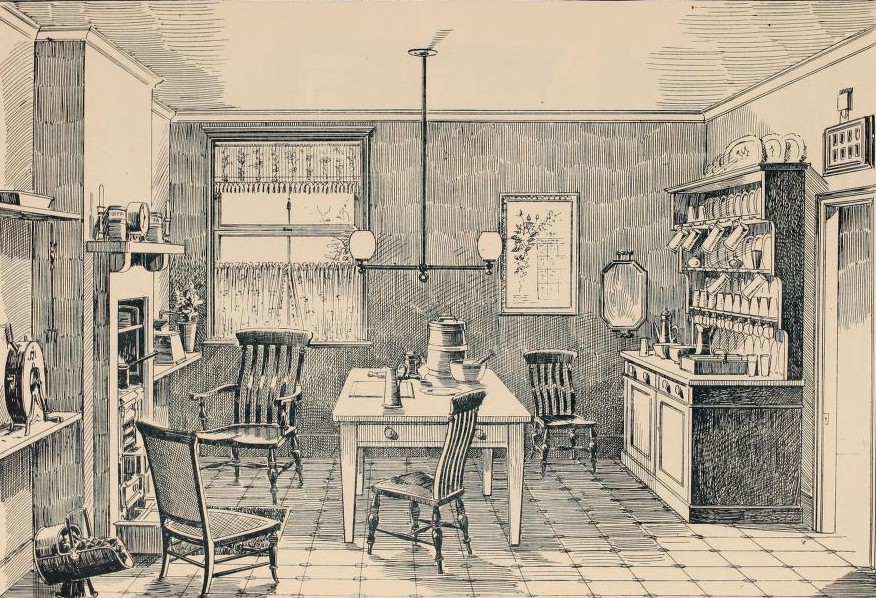
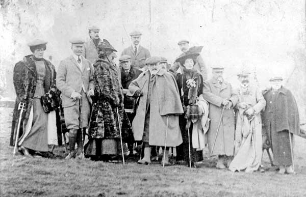
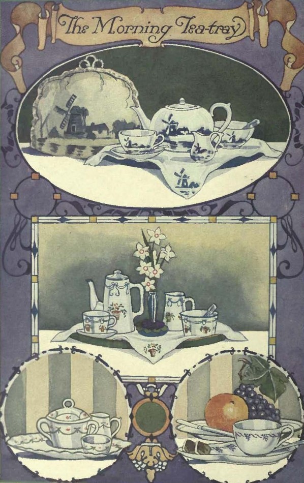
What beautiful colors they chose. But you’d have to have a lot of money to decorate that way in those big houses/mansions.
Yes, which is likely why country houses were repositories for knick-knacks collected over the generations!
They had some interesting color schemes, sounds good to me. I found this entry particularly interesting because I love design.